A New Illustration Style
Pearl and I are continuing to feel a need to “spread our wings” and try new things.
The book that we have been aching to write is a compilation of all of the things that we have learned along the way about The Living Library. Each of our print books has included new details that we’ve learned along the way about The Living Library, but our next project is to compile them all into a single resource book that we believe will entertain readers as well as to help bring the world of birds, and especially songbirds into the world of our readers.
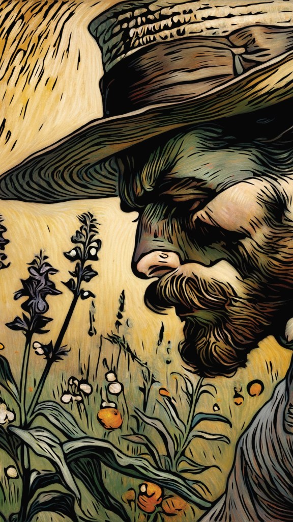
Hopefully this fictional world has been built so well that readers will feel immersed in it, and that is why the illustrations have been drawn using sepia tones when working in Affinity Designer on my iPad.

I like the look of the sepia tones. They compliment the old, yellowed pages of the notebook in which they appear to be found.
The foundational backstory to all of these books is that I, the author, discovered a shoebox filled with notebooks written years ago and hidden away in the attic of my house that I bought. The shoebox had the name “Gracie” written on it along with a pair of pink ballet slippers and other collected treasures. These were all made by a teenage boy named Nate Elliot. (He should be much more relatable to middle grade and older readers than me as as old man!)
One of the values of having illustrations in sepia tones is that it leaves more for the reader to imagine such as the actual colors. This is similar to how a well-written story lets readers fill in the missing details as the story plays like a mental movie.
These pages also capture text intended to tell the story as if a chapter or section of the book was condensed into one or two sentences like a bullet point.
We have stayed away from ePub books because our first-ever book was originally introduced in 2009 as an ePub book because all of the publishing “authorities” said that was what people wanted. We had no sales at all. Zero. Zip. Empty bowl. We are wondering about using sepia illustrations for ePub versions and full-color for print versions.
Author Bio Secret: My favorite movie is The Wizard of Oz. After the overture and opening credits, it begins with a farmyard filled with chickens and filmed in sepia. Chickens are quite impressive, even in sepia!
Author Bio Secret: My favorite color for years was brown. When I painted in high school, I often used a palette of mostly raw and burnt sienna with raw and burnt umber. This gave me a pleasant range of browns that could appear like sepia tones. It also helped me understand and use values of light to dark tones. Value is more important than color!